RIVER COUNSELLING
River Counselling derives its name from nature, which we often seek when we need to be still, exhale and contemplate life. A river is calming and replenishing. It is also a place that listens and offers wisdom. River Counselling seeks to provide the same benefits to individuals.
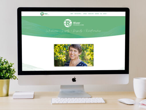
Overall, the logo embodies a sense of gentle movement, which is reflective of the counselling process. The leaf is being held and supported as it journeys along. Both gentleness and strength are expressed through the flowing imagery, curved yet bold font, soft greens and vibrant red.


More work for River Counselling: