TWIGGE ORTHODONTICS
Twigge Orthodontics is a practice in the north-eastern suburbs of Adelaide. Their aim is to become known and trusted in the local community for providing personal, caring and excellent services.
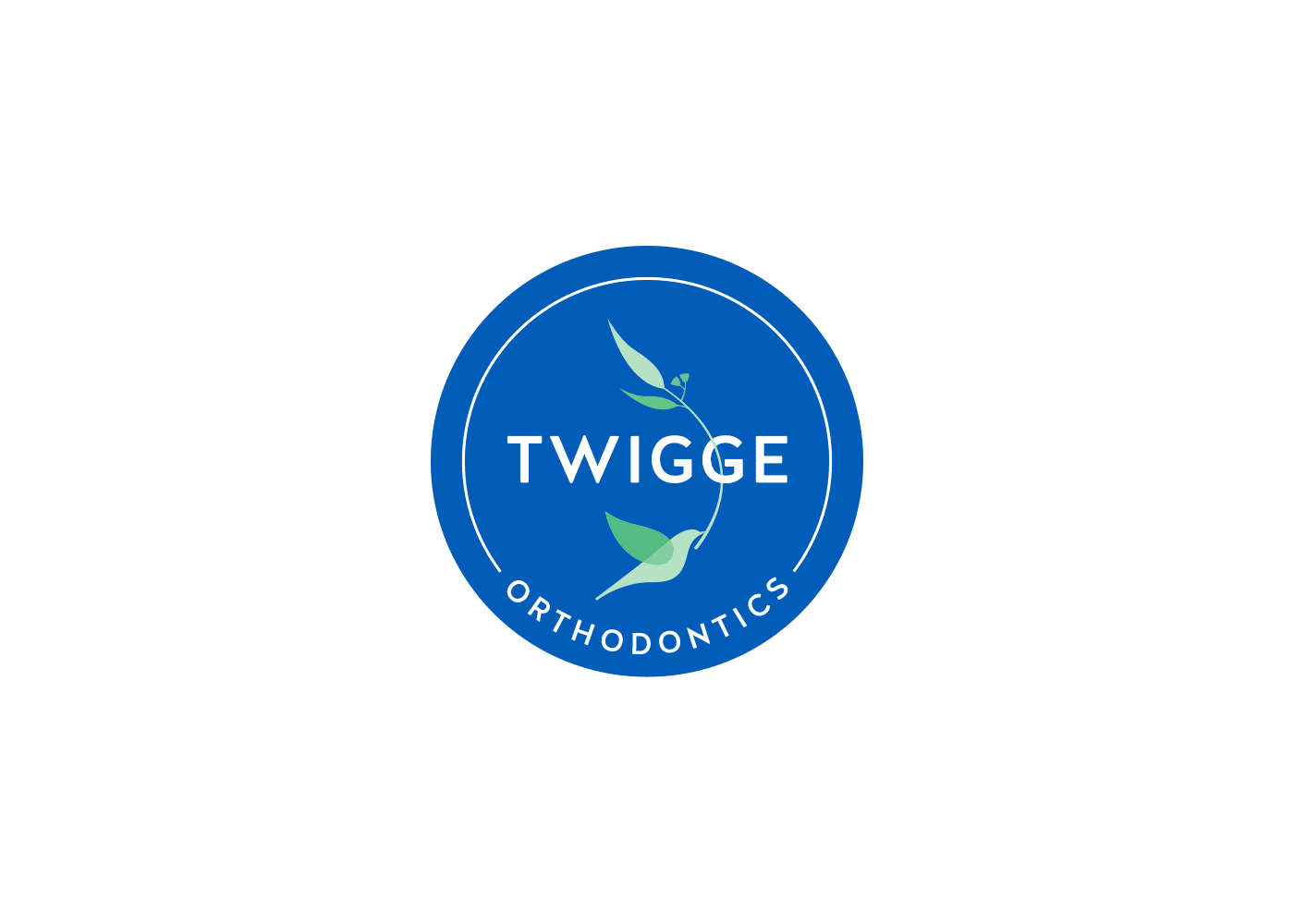
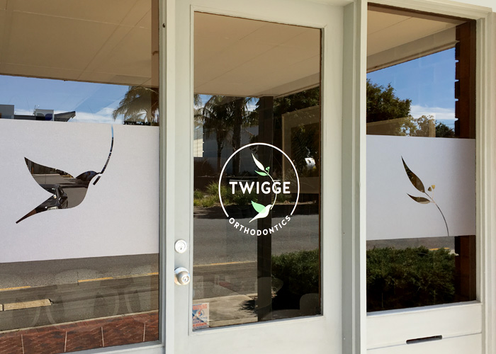
The client was after a logo that included a bird holding a twig in its beak, representing a fresh start as well as their name. Large gum trees are a significant feature in the business’ locality so it made sense to reference them. It was also part of the brief to not include any typical dental visuals so the curve of “orthodontics” only subtly suggests a smile. Overall, the logo was to convey a sense of the practice being established and reliable, whilst being up-to-date with the latest procedures, thus the final result gives a nod to quality-vintage.
